Black Beauty
BLACK BEAUTY
- ROWSON KITCHENS -
Brixton, Taranaki isn’t exactly where Kitchen designer, Annika Rowson expected to discover an entrance to Narnia. But as she or any one else completing a renovation can tell you, always be prepared for a surprise or two…
Discoveries and surprises are common when renovating, and that was exactly what Annika Rowson of Rowson Kitchens found when her client’s started renovating their late 20th century home on a lifestyle block (complete with horses) in Brixton, Taranaki.
When working on the concept for a new kitchen, Annika and her clients quickly realised that the connecting living spaces would also need reworking. Soon after that, the family were packing up their belongings and moving out for three months to allow the builders to get to work also on the bedrooms, bathrooms, master wardrobe and office! The trades would all be on site, so it made sense to utilise them and complete everything at once.
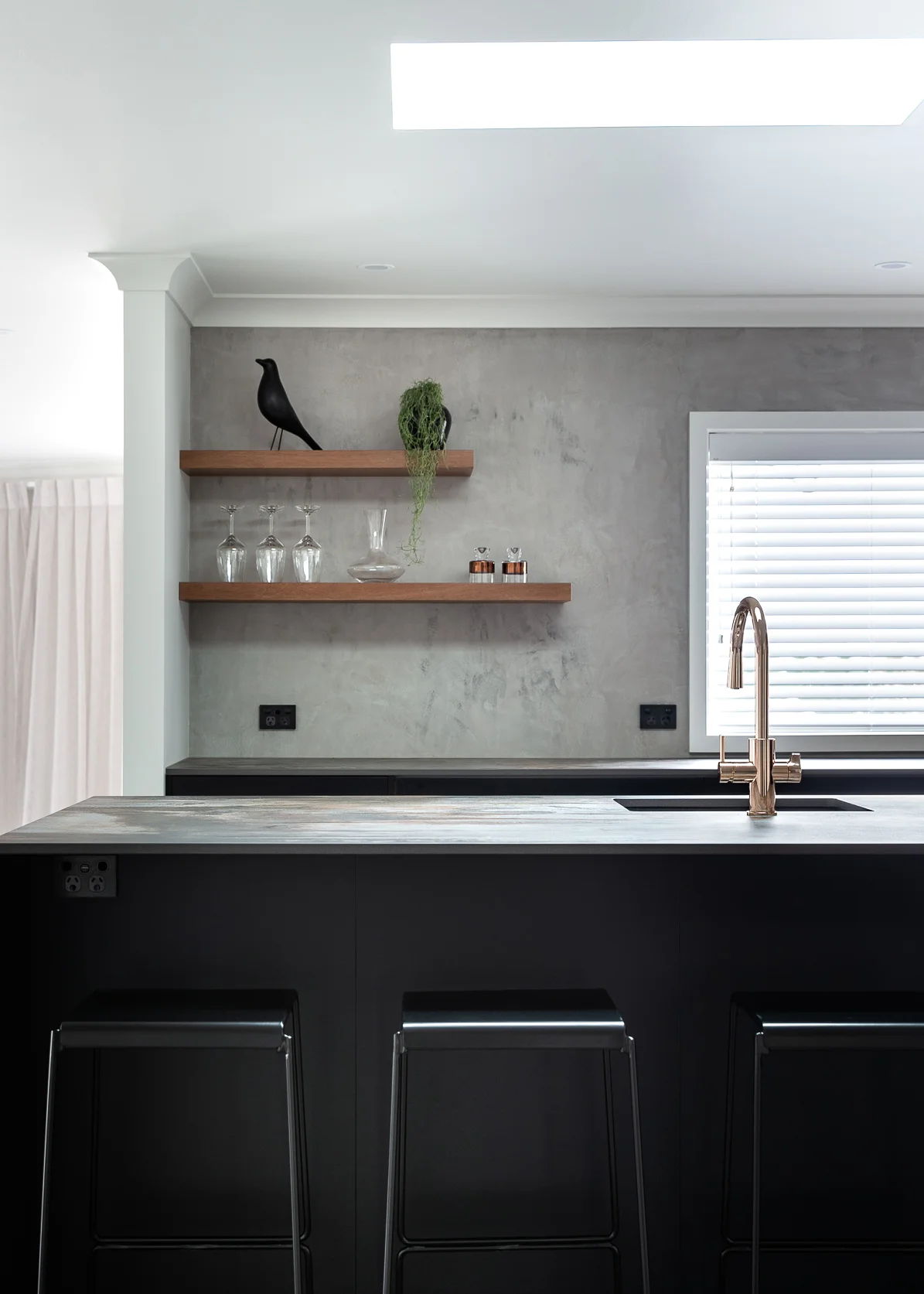
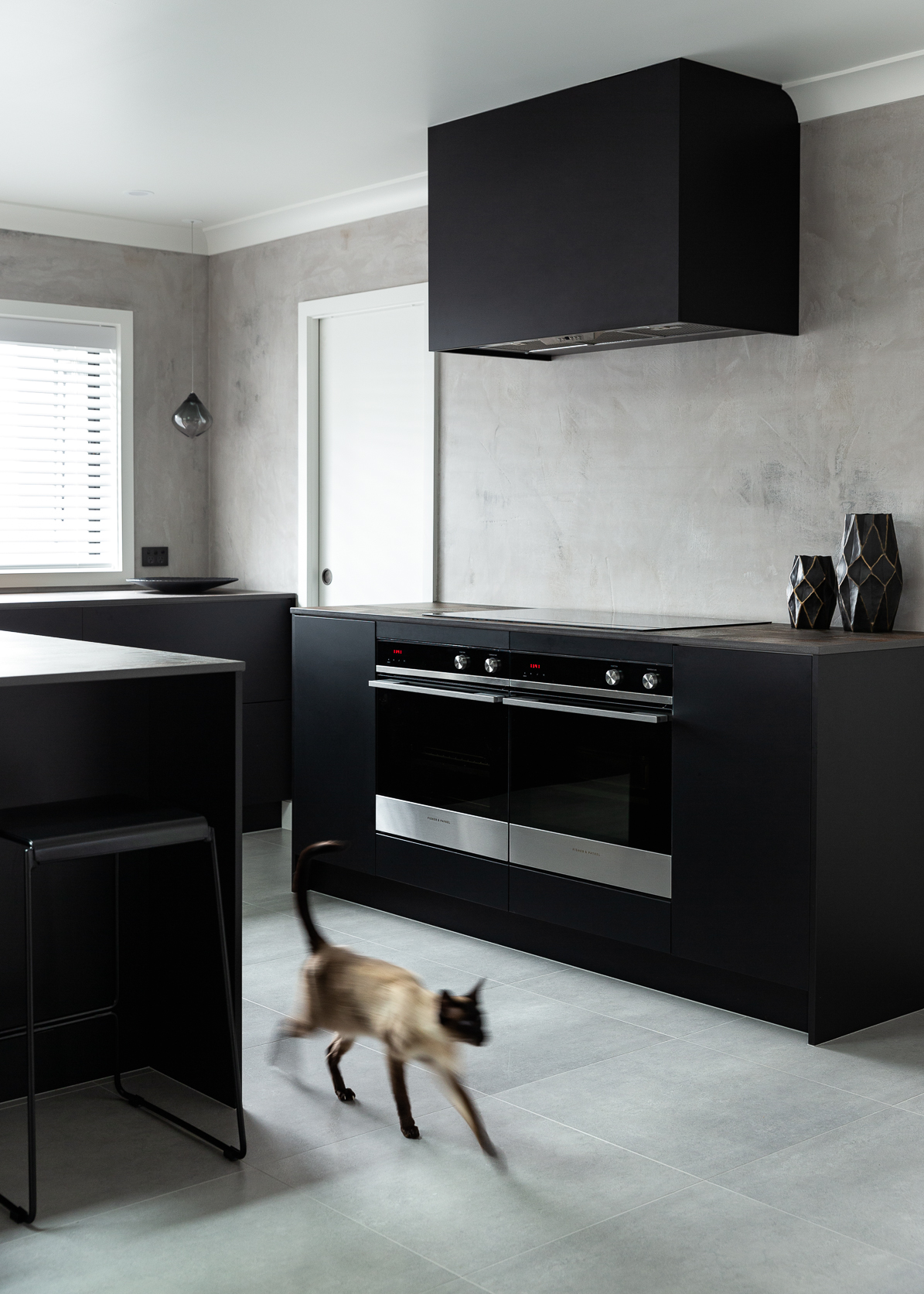
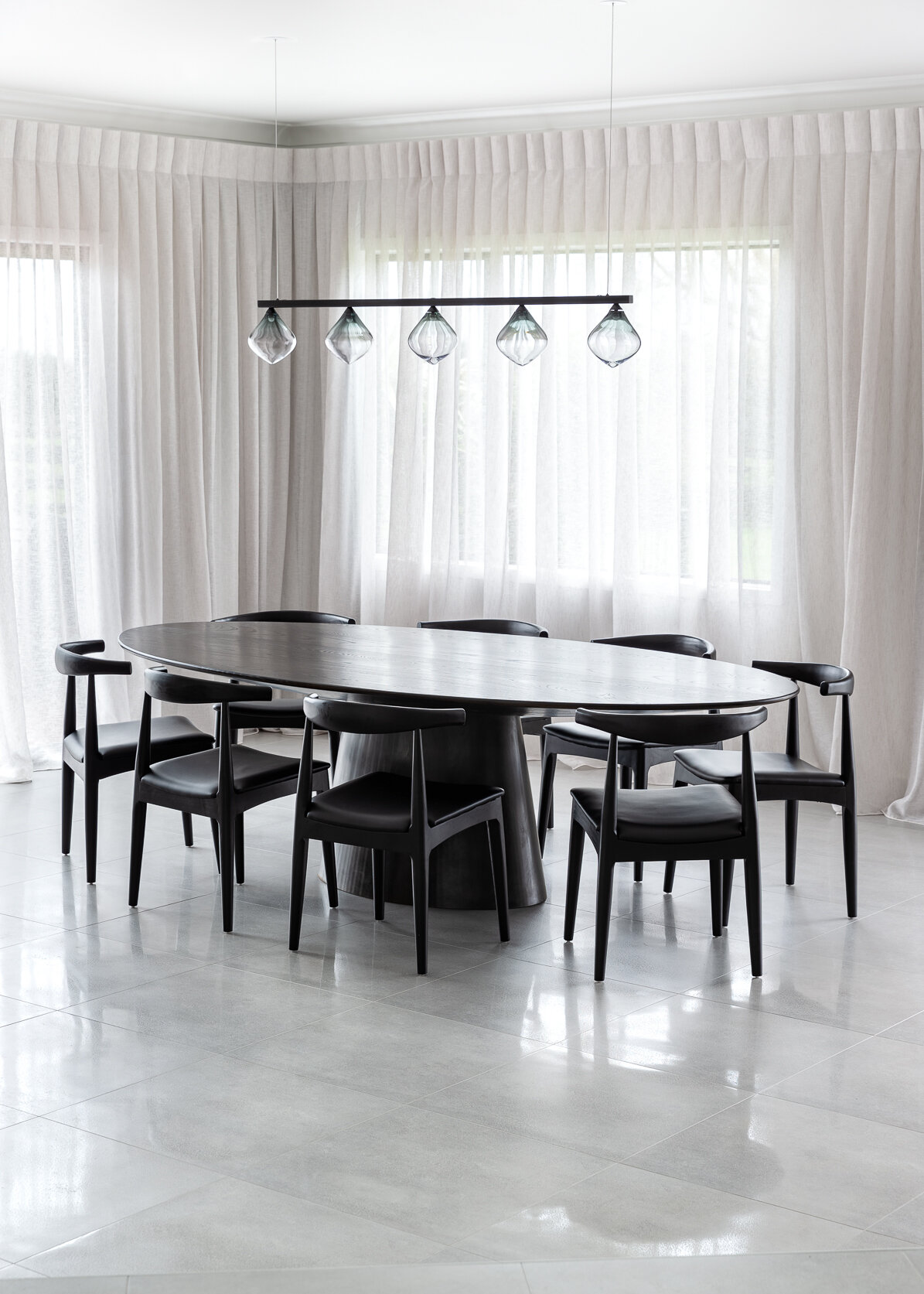
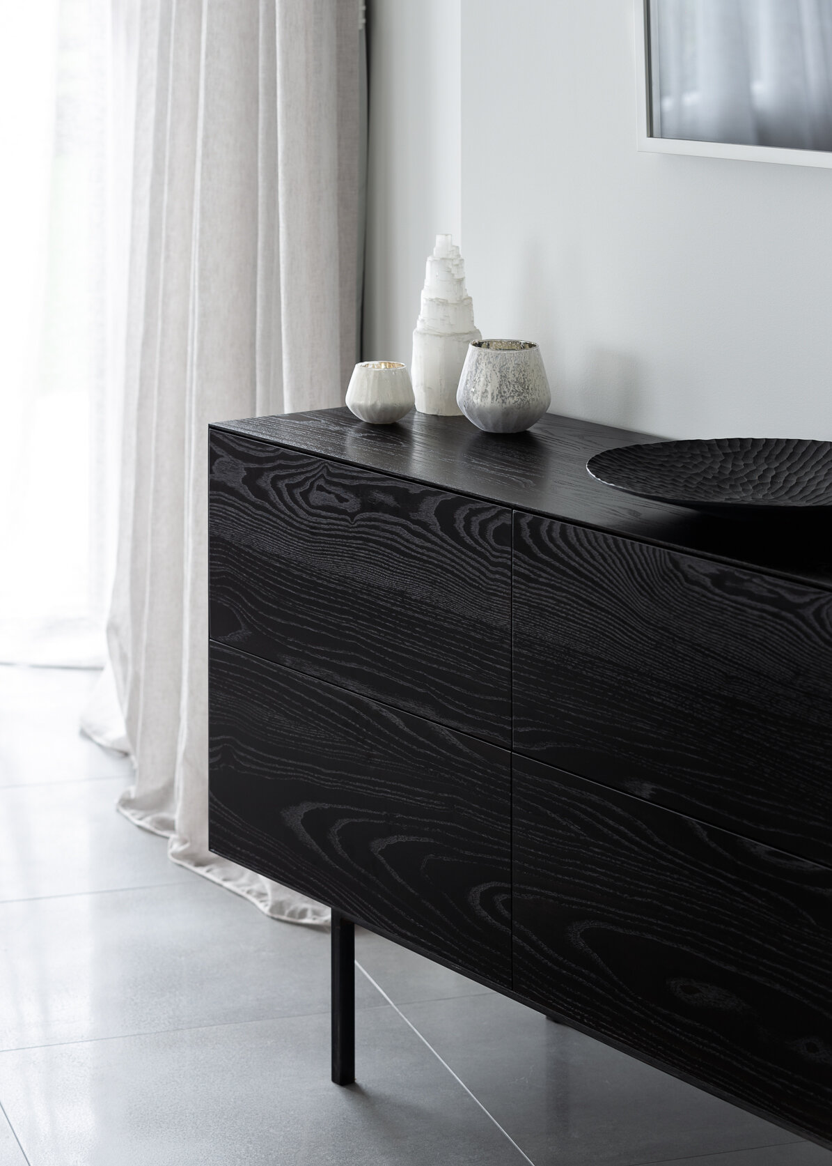
Functionality of the kitchen was important but as it also faces the entrance hall to the home, it needed to make an impact. A dark, textured palette for this space contrasts against the new neutral tiled flooring and wall coverings. Floor to ceiling curtains soften the rooms and custom furniture adorn the spaces while soft grey, plush carpet add a luxe touch to the lounge, bedrooms and hallways.
Connected to the kitchen was addition of a scullery / laundry space that carries on the materiality of the kitchen, with the added warmth of timber upper cupboards.
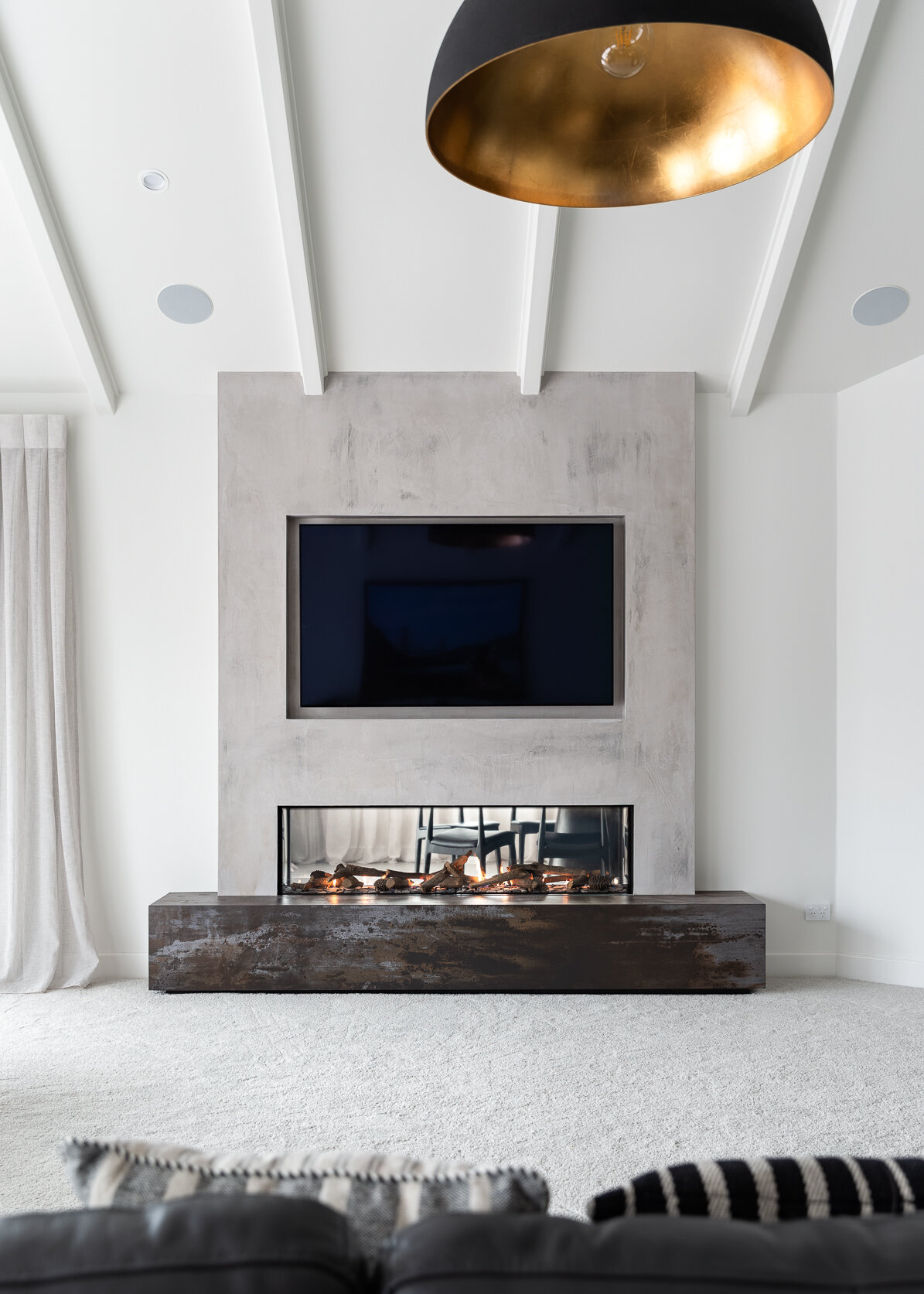
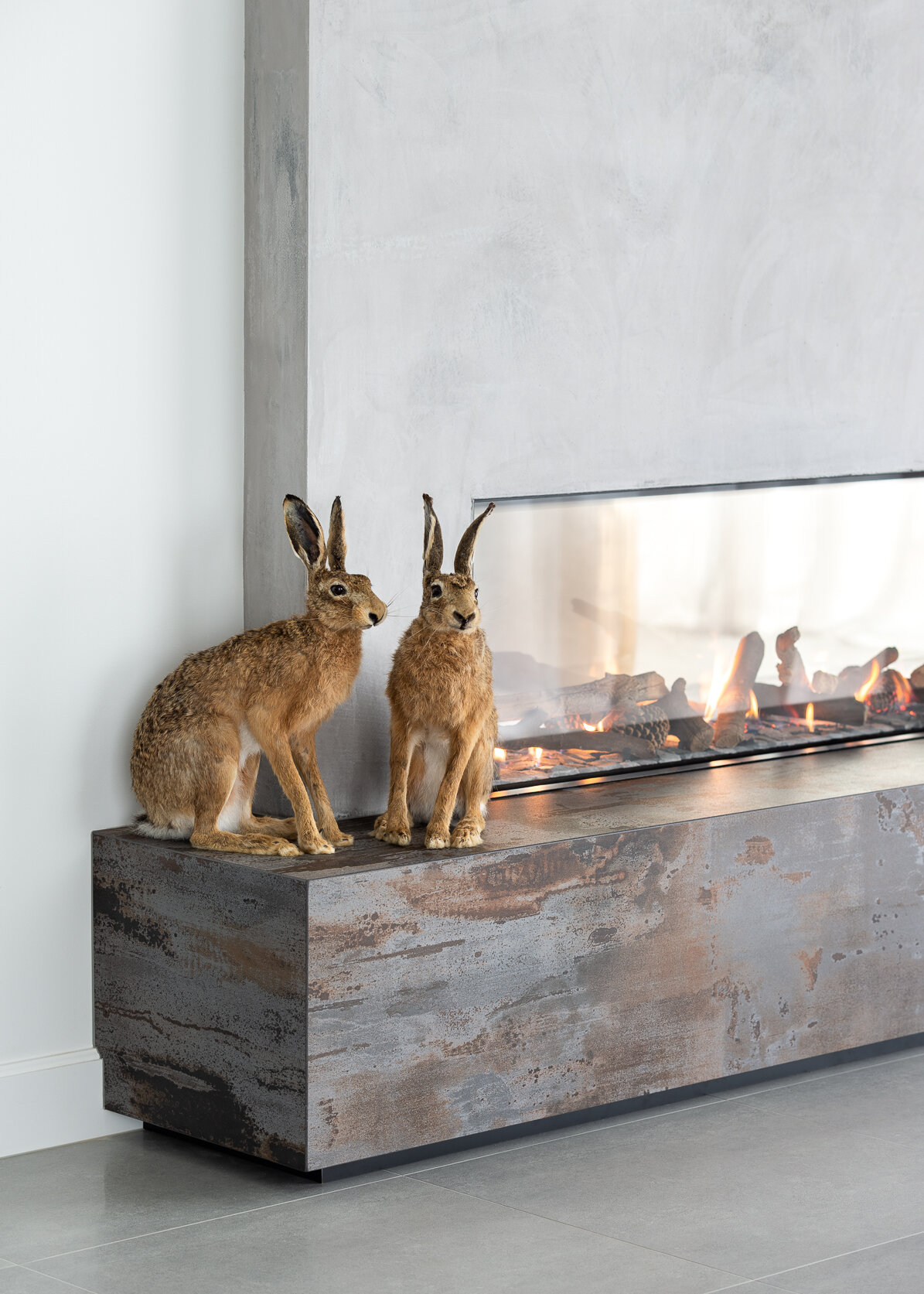
The design features a double sided Escea fireplace on the dividing wall between the lounge and dining room. This wall was intended to create a sense of intimacy in the dining room, and the fireplace allows glimpses of the space beyond and a sense of connection. The Dekton bench tops in the kitchen and bathroom were carried through to the fireplace hearths for a continuation of this texture.
Q & A with Annika Rowson
Can you tell us more about the design scheme?
The kitchen, lounge and dining are quite large, open areas. It was important to add warmth and texture while connecting the rooms, yet adding the right amount of detail without cluttering the spaces and keeping the aesthetic minimal and elegant, yet serviceable. The fireplace has definitely aided in this, creating an elegant dining space and adding much needed warmth to the living room – along with the touch of luxe that only a double sided fire can!
How would you describe your design philosophy?
My design philosophy is a combination of quality over quantity and less is more. I believe it is important to do things once and well – within reason.
It is important to be mindful of where product is being sourced, how it impacts the space and their longevity. Kitchens, bathrooms and interior renovations can be quite an investment, so I feel it should be executed in a considered and thoughtful manner. Striving to deliver spaces that will go the distance is really important to me and my design ethos.
Can you explain your ideas behind the materials and finishes?
We wanted to essentially create a moody and textured kitchen, and the palette really extended from the selection of the Dekton benching in ‘Trillium’, which was then applied not only to the scullery and vanity benching, but also the striking fire hearths.
We wanted to avoid tiling/grout lines on the splash backs and instead opted for a custom finish by Impact Feature Walls, which blends in beautifully. Being sealed it’s also a durable surface that is easy to maintain.
Sage Acrymatte in ‘Eclipse’ was specified for the cabinetry, and a seamless look was achieved by Blum ‘Servo Drive’ for the hardware.
This is a busy home on a rural property, so we specified tiles for practicality and opted for a durable, yet plush nylon carpet in a similar tone. The walls were kept neutral, and the sheer curtains add a luxe element, along with the dramatic feature dome pendant lighting in the lounge and the Soktas lighting in the entrance, dining room, bathrooms and master bedroom.
The kitchen features black joinery. How did you approach lighting the kitchen with this in mind ?
Instead of opting for pendant lighting over the island we decided to install a sky light which made an incredible difference to the space. The original space was very dark & needed the lights on during the day so it was important to ensure there was adequate lighting including new LED down lights.
Favourite moment in the design or build ?
That would have to be how much more brighter, warmer and inviting the home now is. Painting out the old timber ceilings really made a huge difference to the living area also.
Umm, Annika, Where is the fridge ???
The fridge is integrated in the scullery to seamlessly blend into the cabinetry line. It was also positioned here to service both the kitchen & scullery, & to also remove tall cabinetry from the kitchen which offers the kitchen a furniture like appeal
Annika, what advice would you give to those who are about to start a renovation?
Do your research!
My advice to potential clients is to seek out professionals whose aesthetic suits your own, and that you feel comfortable with as you will be investing in your asset and there needs to be transparency and trust for this to occur. Also be open with budgets – as a rule us Kiwis can be quite guarded with this but in all honestly an open conversation regarding budgets in the early days can save a lot of miscommunication the long run!
Lastly plan well, get all of the big decisions locked in so you don’t have to make last minute decisions (although the odd 11th hour change can be life changing!) and enjoy the transformation – renovations are so much fun and with a great team on board you can’t go wrong.
And what’s Your favourite image from our shoot ?
The image of Ronnie peeking in from the scullery! (Mine too!)
Project details
_
LOCATION: Brixton, NEW PLYMOUTH, NEW ZEALAND
YEAR: 2019
DESIGN: ANNIKA ROWSON of ROWSON KITCHENS
JOINERY: Brad, Rowson of ROWSON KITCHENS
BUILDERS: JASON REID BUILDERS
“Kitchens, bathrooms and interior renovations can be quite an investment, so I feel it should be executed in a considered and thoughtful manner. ”
Annika’s favourite moment
<
Ronnie spontaneously poked his head around the corner during this shot, much to our delight!
So where’s Narnia?
“Once we decided to remove an old cupboard located in the master wardrobe we quickly realised there was a random void within the space, which we named Narnia as once the builders pushed through it substantially increased the wardrobe footprint, much to our clients delight!”
Thank you Annika for sharing your project with us!
Follow Annika on Instagram @Annika_Rowson


