Refresh / Revive
REFRESH / REVIVE
- DE COURT DESIGN -
It takes both a clever eye and ingenuity to approach a renovation not with a sledge hammer, but with a subtly and still achieve maximum results.
This is exactly the approach Interior Designer, Amy de Court of de Court Design had when transforming her client’s Ponsonby villa.
The family of three (a professional couple and their 4 year old son) had originally made some minor changes themselves after moving into their new home (an early 1900’s villa that had been extended), but feeling frustrated with the outcome, they engaged de Court Design to pull together their ideas in a cohesive way.
The bones were good, and Amy quickly saw that cosmetically reworking some of the existing features and adding a few new, thoughtful pieces would produce the results her clients were seeking. We chatted with Amy about her approach to this project and the beautiful results.
Q & A with Amy de Court
HEY AMY, DID YOU RECEIVE A BRIEF FOR THE PROJECT? WHAT WAS IT THAT YOU SET OUT TO ACHIEVE?
The Client was after a cohesive look that was contemporary, minimal and slightly luxe.
Upon moving into this Ponsonby villa, my clients made some minor changes – wardrobes, sanding wooden floors, painting, some new furniture etc. They wanted new furnishings throughout the house, a kitchen refresh (i.e. update the look without costing a bomb) and particular help with transforming their lounge and dining area.
CAN YOU TELL US ABOUT THE ORIGINAL HOUSE AND YOUR APPROACH TO THE NEW DESIGN?
The living room and parts of the kitchen had dark wood shelving, which felt a bit drab. We had these parts spray painted white and added a beautiful Carrara marble slab bench top to the living room cabinetry and Carrara marble hexagon tiles for the kitchen splash back. This completely transformed the space, lightening up the open plan living/dining/kitchen space and turning it into a sophisticated yet comfortable family home.
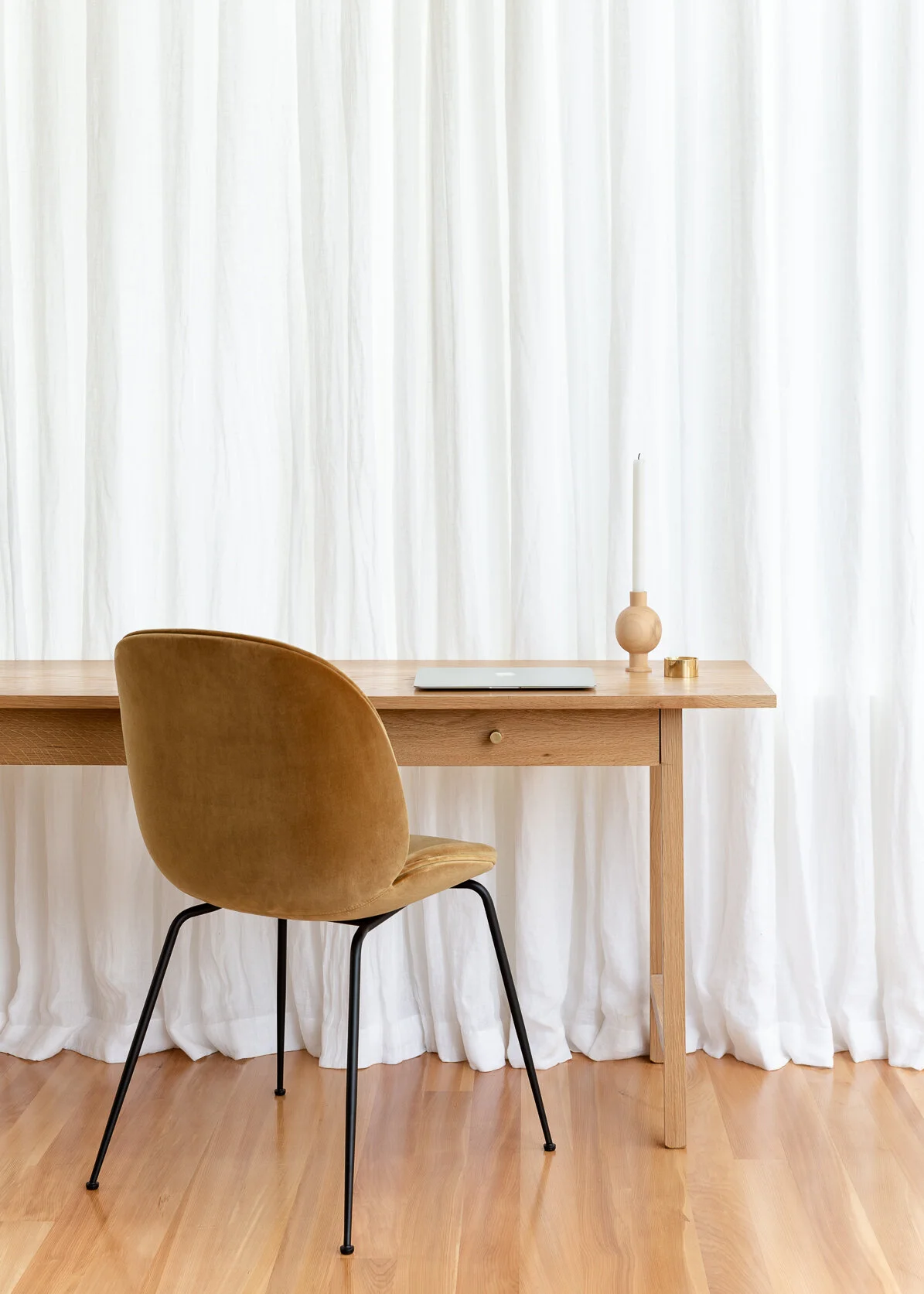
We introduced some beautiful furniture pieces, predominantly by NZ designers. The addition of white linen curtains at the back of the house brought a beautiful soft textural element. The sun streams through the living/dining room area most of the day, and my client works from home, so she can pull the curtains and enjoy the sheer curtain effect, while at the same time getting some relief from the sun!
The design feels simple and minimal, but also comfortable and fresh. How did you achieve this result?
I think this is achieved by balancing a simple base of white walls and white linen curtains, with other sumptuous textural fabrics in warmer tones. The stunning midnight blue Armadillo & Co rug adds some depth along with the blue linen Simon James ‘Outline Sofa’, which ties in with this perfectly. Throw in the marble accents and you have a home which is rich in texture, with a nod to subtle colour.
WHAT WAS YOUR APPROACH TO COLOUR THROUGHOUT THE HOUSE?
A base colour palette of white and grey was used, with consistent accent colours of blue and mustard mixed in throughout the bedrooms and living room.
Do you have a favourite moment in the house ?
I love how the whole house works together so well now. But if I had to choose a favourite, it would be the divine study nook complete with the mustard velvet ‘Gubi’ chair. I could work there any day!
i spy a great collection of locally designed pieces in this project. How open was your client to supporting nz design?
Our amazing client was totally aligned with our vision from day one. We loved her appreciation for good quality design pieces, with an emphasis on New Zealand makers. Rather than cutting any corners and buying pieces that may have been easier on the wallet, she saw the merit in investing in timeless pieces that will truly stand the test of time.
Can you share a memorable moment from our shoot ?
Pulling out the hair straighteners for a quick fix, to iron out of the creases on the linen duvet cover! (Mine too! And it was surprisingly effective…)
AND Do you have a favourite image we shot the day?
The living room cabinetry image, complete with shelves styled just-so and moody brass and midnight Douglas and Bec wall sconce. This image reminds me of just how much this space has been transformed via small cosmetic tweaks!
Project details
_
LOCATION: PONSONBY, AUCKLAND, NEW ZEALAND
DESIGN: AMY DE COURT, DE COURT DESIGN
YEAR: 2019
HOUSE SIZE: 3 BEDROOM VILLA, with 2 BATHROOMS
“Our amazing client was totally aligned with our vision from day one. We loved her appreciation for good quality design pieces, with an emphasis on New Zealand makers. Rather than cutting any corners and buying pieces that may have been easier on the wallet, she saw the merit in investing in timeless pieces that will truly stand the test of time. ”
Amy’s favourite image
<
“This image reminds me of just how much this space has been transformed via small cosmetic tweaks!”
A big thanks to Amy for sharing her thoughts with us! x
Follow de Court Design on Instagram @decourtdesign


