Material Girl
MATERIAL GIRL
- ROWSON KITCHENS -
How does a designer approach their own project?
_
For this clever duo, they embraced the experience. Using it as an opportunity to experiment, they tested materiality, pushed ideas and the results speak for themselves.
When it came time to renovate their New Plymouth Design Space, Rowson Kitchens, the kitchen design / manufacturing duo, Annika and Brad Rowson knew this was their chance to bring brave ideas to fruition that had been simmering away from inspiration found abroad, just waiting for the right time.
Their combined brief was simple: Create a space that tested material application (often tricky to do on a client’s time) and one “that was bold, yet gentle and elegant”. Check, check and check.
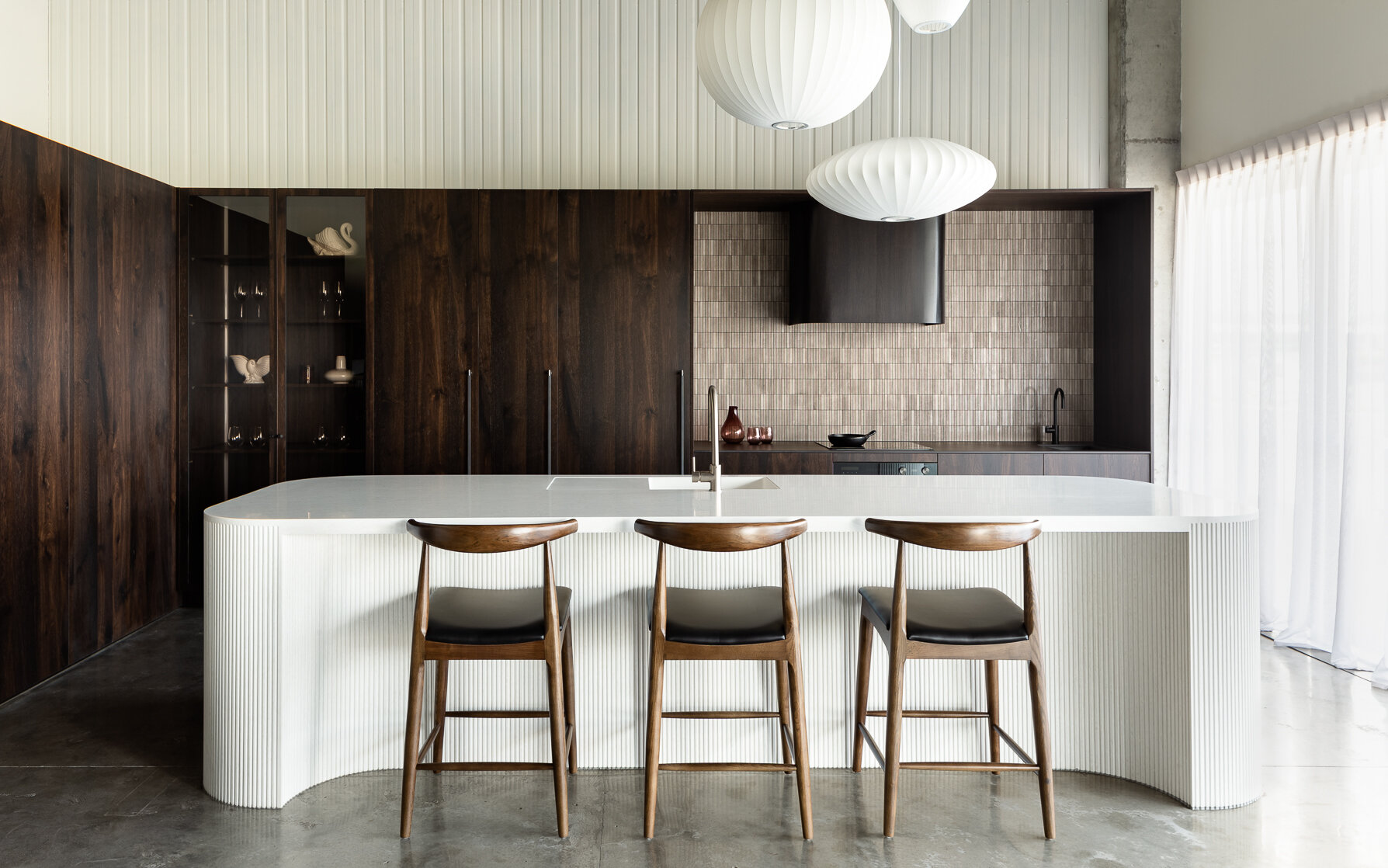
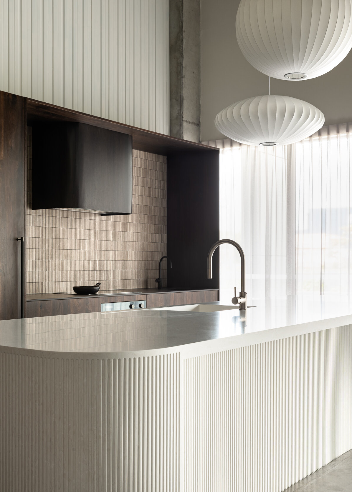
The hero of the space is a sophisticated, curved island that appears carved out of a solid block of stone. But it doesn’t end there with every surface, appliance and detail deeply considered and working together to complete their show stopping design.
I chatted to Annika Rowson about their fresh approach to their own space, how it all came together and life home-schooling their two sons. All this while working from home under testing Covid-19 Level 4 conditions.
Q & A with Annika Rowson
_
THE DESIGN
Hey Annika, Can you tell us a little about the genesis of the kitchen’s unique design? Was it a material you wanted to experiment with or something else that ignited the idea ?
I wanted to incorporate a curved island into the design space, as I love the elegance of their form. The fluting was something I admired in my last European jaunt, along with rich timbers and glass display units. I find my inspiration comes from either travelling or thunderbolts!
can you walk us through the design’s features and materials ?
I wanted to create a rich, elegant space so I selected ‘Smoked Oak’ veneer to contrast against the creamy neutral island. The space features strong vertical lines – from the flutes to the Buster + Punch smoked bronze closet bar handles, the travertine finger tiles, the pendant lighting, sheer curtains and wall panelling.
The bronze glass works beautifully with the veneer and the travertine tiled splash back also compliments this. The curved oak rangehood unit mimics the island form and the Dekton hob bench has a secondary sink that is fitted with a Hydro Tap for instant hot water (and cups of tea!).
Blum ‘Legrabox’ hardware features throughout, with a combination of ‘Servo Drive’ and ‘Tip-On’ and a space tower pantry unit.
The kitchen features a full suite of Fisher Paykel appliances, including the new column refrigerator and freezer units.
how do you go about putting together a material and colour palette for a project?
I like to consider all aspects of the space; The light, the aesthetic of the home, who lives in it and will be using the space. Once we have discussed the needs of our clients and how they work in their kitchens, this provides me with the information required to specify materials to suit their needs. I am fortunate to work with clients that are very trusting and open to my recommendations, and I only specify materials that I would have in my own home.
My ethos is quality over quantity (it is the recycler in me!) and I am mindful of doing this once and right – within reason and within budget. Honest discussions in regards to budget are also important, as I can direct clients to materials that reflect this, and we also consider the value of the home to help the client consider the investment required to add value without over-capitalising.
Being your own client, did you feel any extra freedom to experiment in this kitchen ?
For sure - a combination of not having to work to a budget and also being a manufacturer ourselves meant that there were very little restrictions. I could also watch the design evolve and make any necessary last minute changes.
The island bench detail is sensational and it’s evident a lot of work went into it! Can you describe the materiality and construction?
I have been reversing Corian for two years now - This essentially is flipping the sheet over, using the underside of the Corian. It has a unique pattern, which results from the minerals being slightly heavier than the polymers, therefore sinking to the lower level of the sheet. Corian is a fantastic material to work with for it’s ability to be shaped and can also be joined seamlessly, which made it ideal to curve.
Brad very patiently hand fluted the Corian – It was only meant to be on the curves but once he started we loved the look so much that we decided the whole island needed to be fluted! It also features our rebated hot points and a Corian ‘Duo 023 bowl’ and custom recessed drainer.
Do you have a favourite moment or detail in the design?
Deciding to add the flutes and bronze glass!
new ideas often generate new challenges to overcome. Did you find anything particularly challenging to work through while designing and manufacturing this kitchen?
Making sure everyone understood my vision initially was the main challenge, and once we were all on the same page, we had samples made of the curves that we then experimented with flute width/depth etc. This was not only super helpful, but was also exciting to see a peep of the concept!
I spy something we haven’t seen in contemporary kitchens in a while – a built in china cupboard! Are you foreseeing the return of these?
Yes! They are so elegant and while I like integration, I think it is a gentle way to break a solid line of cabinetry and display our treasures too.
The showroom space has a double height ceiling and we see you framed the cooking area to draw the eye down. Any tips for readers with high studs or complicated ceiling pitches on how they can achieve this also?
I often frame out spaces like this to create a finishing point for the splashback, and to also highlight generous ceiling heights. I prefer to keep a space between the top of the cabinetry and the ceiling when the height is substantial – it draws the eye up and creates drama within the space.
Any interesting stories or quirky details etc. that you’d like to share about the process or design?
Brad hand routering the flutes individually was definitely an achievement! We have since installed another Corian island with fluting only to the curves and this was done by CNC – it will continue to evolve! The island was also going to be a totally different colour at one point – a very textured and a mid-toned Corian called ‘Dune Prima’, but I went back to my initial ‘Cirrus White’ specification, which I am so pleased of as I feel that this is what created that marble-like effect, along with that calm and creamy aesthetic.
Pushing the boundaries is always a nerve-wracking business and we’ve spoken before about the need to overcome our inNER critics. What advice would you give to those who are feeling the same about their ideas?
I think it is important to be kind to ourselves and to be brave. While it is natural to feel nervous at times, I think a little bit of fear is also a good thing – it pushes us forward and challenges us also.
Project details
_
LOCATION: ROWSON KITCHENS, 2 DEAN PLACE, WAIWAKAIHO
NEW PLYMOUTH, NZ
YEAR: 2019
DESIGNER: ANNIKA ROWSON, ROWSON KITCHENS
JOINERY: ROWSON KITCHENS
On supporting local design…
“I try to support local suppliers / NZ made wherever possible and moving forward I will be even more mindful of this, as we need to support our economy.”
TELL US MORE ABOUT YOURSELF, ANNIKA
you’re a business owner, but also a Super Mum WITH two sons. How are you balancing work and home life in your bubble during the Covid-19 shut down?
I would say more like shouty mum at the moment, lol! I am trying to be kind to myself and not put too much expectation/emphasis on school work – I am not a teacher and I think it is unfair to expect children to learn in an environment that is far from a classroom. Children have such a long summer break and survive fine, so I think it is about doing what works best for your family. We try to do a couple of hours per day of activity/work then we generally bake and the boys have been enjoying bike rides.
The kitchen has really been our place of comfort, with many shared meals created together and the boys have been enjoying cooking and trying new recipes too.
We’ve all had more time to reflect on our day to day and businesses during this time. Do you have some changes or new ideas in mind for post-shut down?
I hope to be able to implement more of the things we have enjoyed together into our daily routines – prior to this we were always so busy with very hectic schedules so I hope that we can enjoy a slightly slower pace with more shared meals, slow mornings & quiet moments. I also hope consumers will see the importance of supporting our local and small businesses moving forward - they need us more than ever. While I am always mindful of supporting NZ made, being a manufacturer I will be looking even more closely at our materials and buying NZ made wherever possible.
Going into a shoot, you always put a lot of thought into how you want to capture a project. What aspects do you consider?
I like to think of the overall space, how the kitchen fits into the room, what is adjacent for example. Lighting is really important. It has to be natural light to allow the materiality to shine. Also animals - They feature in many of our shoots and add a homely aspect!
Do you have any memorable or standout moments from our shoot?
Every shoot with you is memorable! But seeing you not only understand but appreciate the design was so lovely, quietly and calmly moving through the space and capturing it so perfectly was magic to watch. Your reassuring comments quietened my inner critic and it has been a pleasure to share the space with such stunning imagery.
Annika’s favourite moment
>
“It really highlights the flutes, curves & that generous stud height. It is such a gentle, beautiful and calm shot.”
About facing our inner critics…
“While it is natural to feel nervous at times, I think a little bit of fear is also a good thing – it pushes us forward and challenges us. ”


